Keynote:
An Instagram Story background is the visual base that supports your message and shapes how viewers perceive your content. It improves readability, sets the emotional tone, and helps build a consistent visual identity. Solid colors, gradients, photos, textures, and blurred images are commonly used to create backgrounds that look clean, intentional, and easy to read. Choosing the right background makes your stories more engaging and helps viewers focus on what you want to say.
Creating the perfect Instagram story background is often more important than people realize. It’s the element that shapes the first impression, sets the emotional tone, and decides whether viewers stay or swipe away. Many users struggle with backgrounds that feel too busy, make the text unreadable, or don’t match their personal or brand style. The truth is, a thoughtful background can transform a simple story into something polished, expressive, and memorable. In this guide, you’ll find practical, experience-based techniques to help you create story backgrounds that look intentional and feel effortless.
Why the Background Matters
Your background is the foundation of your story design. Even a beautifully written message gets lost if the background doesn’t support it. On the other hand, a well-chosen background can elevate the simplest idea, whether it’s a quote, a photo, or a small daily update.

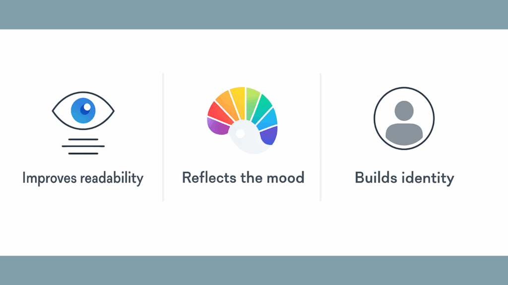
A strong background does three things:
- Improves readability: Clear contrast keeps viewers engaged.
- Reflects the mood: Colors and textures shape emotion faster than words.
- Builds identity: Consistent backgrounds make your stories recognizable.
When people scroll through dozens of stories in seconds, you need visual clarity and intentional design to make them stop and pay attention.
How to Add an Instagram Story Background
Here is the process explained step-by-step with clear numbered instructions, so you can follow along easily and recreate the same Instagram Story background on your own without missing any detail.
Add a Solid Background Color

This method is ideal when you want a clean, simple background for text or stickers.
- Open Instagram and swipe right to access the Story camera.
- Take any photo or upload an image from your gallery.
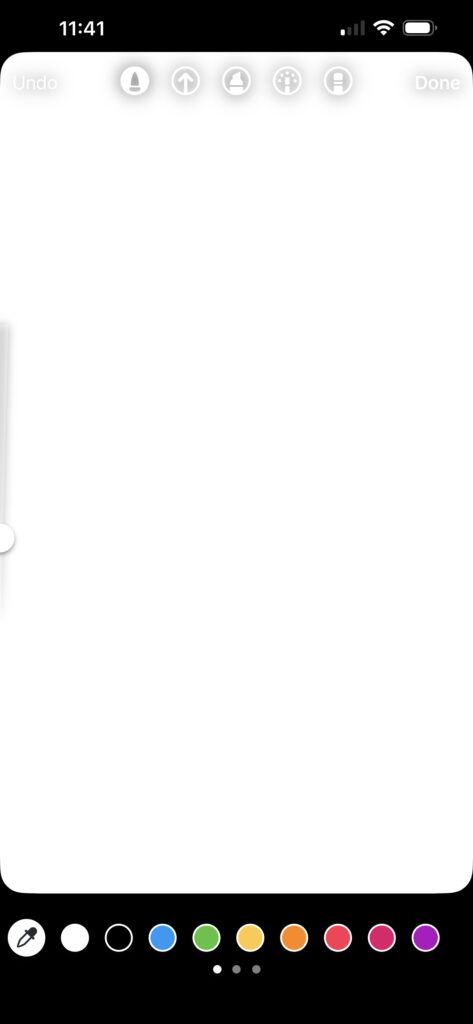
- Tap the drawing tool at the top of the screen.
- Choose a color from the palette or use the eyedropper to match a tone.
- Press and hold anywhere on the screen until the background fills with that color.
- Add text, stickers, or GIFs on top of your new background.
Change the Background When Sharing a Post or Reel
Use this option when resharing feed content and want the background to match your design.
- Tap the share icon on the post or Reel and select Add to Story.
- Once the post appears in the Story editor, tap the color button at the top.
- Choose a new color or use the eyedropper tool to match the content.
- The background updates instantly behind the shared post.
- Edit and publish as usual.
Solid Color Backgrounds
Solid backgrounds remain timeless because they’re simple, neat, and effective. They remove distractions and make your message the center of attention.
When choosing solid colors:
- Use warm tones for energy and positivity
- Use soft pastels for calm, lifestyle-oriented stories
- Use dark colors for dramatic, high-contrast text
- Use your brand colors for consistency
Solid backgrounds are also great for announcements, quotes, reminders, calls to action, or any text-heavy content. Instagram’s draw tool makes creating them incredibly easy; choose a color and hold your finger on the screen.
More than anything, solid colors let your audience focus on what you want to say.
Gradient Backgrounds
Gradients add visual interest without feeling overwhelming. They deliver depth and a more contemporary aesthetic while still keeping your story clean.
There are two main types of gradients to consider:
- Soft gradients: pastel-to-white, beige-to-cream, and blue-to-light-blue. They feel gentle, minimal, and aesthetic.
- Bold gradients: pink-to-orange, purple-to-blue, and teal-to-yellow. They feel expressive and playful.
Gradients are perfect for creators who want something visually appealing but still easy to read. They also help add personality to otherwise simple announcements or captions.
Photo-Based Backgrounds
Photos are emotional by nature; when used properly, they can make your story feel personal, inviting, and authentic.
However, not all photos work well as backgrounds. You should look for:
- Negative space (empty areas where text can be placed)
- Minimal colors
- Soft lighting
- Simple compositions
Examples of strong background photos include:
- A clean wall
- A cafe table
- Sky or clouds
- An ocean or horizon
- A window with light
- A soft corner of a room
- A plant against a blank background
When a photo feels too busy, apply a blur. This preserves the mood of the image but makes the text much more readable. Many influencers use this method to balance aesthetic visuals with clarity.
Texture and Pattern Backgrounds
Textures add personality without feeling loud. They add subtle character and can help build a consistent style if you choose similar tones.
Some popular textures for Instagram story backgrounds include:
- Marble
- Linen fabric
- Concrete
- Kraft paper
- Watercolor washes
- Light grain or noise
Patterns can also work nicely, as long as they stay subtle. Soft waves, dots, tiny lines, or geometric shapes can make your story look polished.
The rule is simple: if your pattern competes with your message, it’s too strong.
Blurred Backgrounds
Blurred backgrounds are among the most useful choices for modern Instagram stories. They create the perfect balance between context and readability.
Why they work so well:
- They keep the emotional tone of the original photo
- They create high readability
- They look soft, minimal, and aesthetic
- They take only seconds to make
Blur is especially effective for:
- Announcements
- Quotes
- Polls and questions
- Event posts
- Behind-the-scenes content
Blurred backgrounds are also helpful when you want to share a messy environment without showing too much detail.
Instagram’s Built-In Background Tools
Instagram’s built-in features are more powerful than most people think. You can create clean and stylish backgrounds directly inside the app.
Create Mode
Offers gradients, color palettes, and quick templates for clean, simple stories.
Eyedropper Tool
Lets you pick colors directly from your photos. This helps create visual unity between different parts of your content.
Draw Tool
Press and hold to create full-screen backgrounds instantly.
Shapes & Stickers
Semi-transparent shapes can highlight text and make busy backgrounds readable. Frames, arrows, or minimal shapes can create structure within your design.
These tools are great for quick storytelling when you don’t want to switch between editing apps.
Third-Party Apps for Better Backgrounds
Some creators want more flexibility or creative control. That’s where external apps become helpful.
- Canva: Perfect for templates, typography, color matching, and clean layouts.
- Unfold: Known for its editorial, minimalist templates—great for storytelling.
- Mojo & Seen: Ideal for animated backgrounds, dynamic text, and motion effects.
- VSCO: Delivers consistent color tones across photos for branded visuals.
These tools allow you to create higher-level, more unique story designs.
How to Match Backgrounds to Your Content
Different story types call for different backgrounds. Matching them improves both clarity and emotional impact.
- Quotes: Use solid colors, soft gradients, or subtle textures.
- Personal moments: Use lifestyle photos or lightly blurred images.
- Product stories: Use clean textures or brand-colored backgrounds.
- Tutorials or tips: Use solid or gradient backgrounds for clarity.
- Event announcements: Use high-contrast or blurred photo backgrounds.
When your background matches the message, the story feels more cohesive. Don’t forget, even adding a link or music to a Story can make a difference.
Creating a Consistent Style
One of the easiest ways to look more professional is to develop a visual identity for your stories.
Try building consistency through:
- A specific color palette
- Matching tones or filters
- Similar background themes
- Repeating design elements
- Consistent text alignment
- A preferred font style
Consistency builds trust. Even if the content changes, a unified style tells viewers who you are without needing to say it.
Common Mistakes to Avoid
Even strong storytellers sometimes use backgrounds that work against them. Avoid:
- Busy photos with too many details
- Low-resolution images
- Low contrast between text and background
- Neon gradients against neon text
- Too many stickers or GIFs
- Randomly changing styles
- Overly patterned backgrounds
A good rule: if it distracts from the message, remove it.
FAQs
Solid colors, soft gradients, and minimal textures typically look the cleanest and most polished.
Use Instagram’s draw tool and hold your finger on the screen to fill the background instantly.
Yes, they balance atmosphere and clarity, making text easier to read.
Increase contrast or place a semi-transparent shape behind your text.
If you want consistent, recognizable content, brand colors are a strong choice.
Stick to a limited color palette, similar textures, and the same general design style.

Comments & Discussion
Add Your Comment
Share your thoughts and join the conversation